Snack box design principles for safer, clearer and more efficient packaging
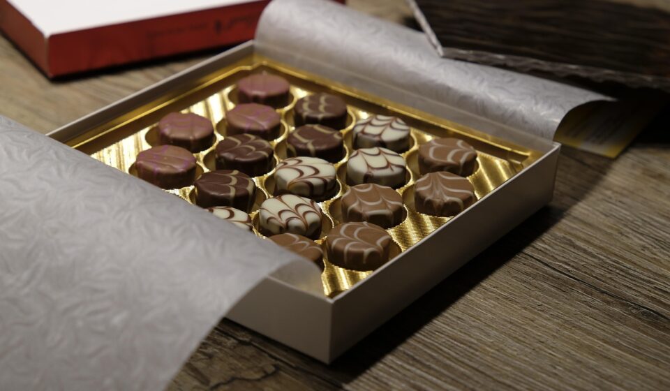
What a snack box must solve
Effective snack box design is not just a shelf-appeal exercise. The box has to protect fragile or oily food, communicate flavor and portion information quickly, fit retail and shipping requirements, and leave room for accurate labeling. The most useful design decisions start with the snack itself: shape, weight, moisture level, grease content, aroma, shelf life, and sales channel.
A crisp paperboard carton for crackers, a grease-resistant sleeve for baked snacks, and a mailer-ready multipack for online sales may all look like simple boxes. In practice, they solve different problems. Packaging teams should treat structure, artwork, material selection, compliance review, and production setup as one connected workflow, not as separate handoffs.
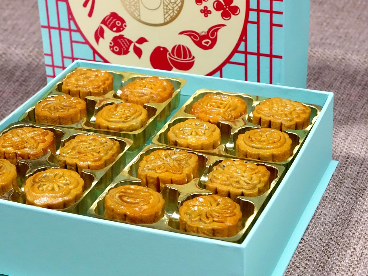
This guide focuses on practical design choices for snack brands, packaging buyers, and content teams following developments in box design. It does not replace regulatory or engineering review, but it highlights the decisions that most often affect safety, clarity, cost, and customer experience.
Start with product behavior before choosing a box style
A snack box should be designed around how the product behaves in handling, storage, and distribution. Two products may sit in the same retail aisle but need very different structures. A granola bite may need oil and aroma control, a cookie may need crush resistance, and a popcorn multipack may need volume efficiency more than rigidity. If the structural brief starts with a generic carton size instead of the protection requirement, important details are easy to miss.
Fragility and movement inside the pack
Breakage is one of the first risks to check. Thin crackers, wafers, cookies, and filled pastries can chip or crumble if the box has too much internal space or weak compression strength. Designers usually manage this through tray inserts, a tighter product fit, carton depth, flute choice for corrugated formats, or secondary wrapping.
The goal is not always to eliminate movement completely. Some snacks need controlled space to avoid pressure damage. The right structure depends on product shape, stack height, pack count, and the expected distribution route.
Moisture, grease, and aroma
Dry snacks often depend on low moisture exposure to stay crisp, while baked or fried snacks may need grease resistance to protect the printed surface and the consumer’s hand. Aroma can also become a packaging issue. Strong flavors may require inner packaging or barrier layers so the carton does not absorb odor.
These requirements affect material selection, coatings, window use, and whether direct food contact is intended. If the food touches the box, the material specification should be reviewed for food-contact suitability in the target market.
Retail, food service, and ecommerce routes
A snack box designed for a supermarket shelf faces different pressure than a box designed for subscription kits or office pantry deliveries. Retail cartons need fast recognition, shelf blocking, barcode reliability, and case-pack efficiency. Ecommerce formats need stronger corner protection and may require fewer decorative weak points, such as large windows or complex cutouts. Food service packs may prioritize quick opening, portion control, and disposal.
Defining the route early prevents artwork preferences from driving structural decisions the package cannot support.
Build the graphic system around quick recognition
Snack purchases are often fast and visually driven. A box needs to make the product type, flavor, quantity, and brand easy to understand at a short viewing distance. Good graphics do not simply add color; they create a hierarchy that helps shoppers make a decision without reading every panel.
Make the front panel work in seconds
The front panel should answer four basic questions: What is the snack? What flavor or variety is it? How much is inside? Why should the shopper care? That sequence can be handled through the product name, flavor color, concise benefit statement, image style, and net weight or count placement.
If too many messages compete for the same visual weight, the package becomes slower to read. A cleaner hierarchy often works better than a crowded design because it reduces decision friction at shelf.
Use flavor coding without losing brand consistency
Snack ranges often include multiple flavors, formats, or dietary variants. Color coding can help shoppers identify a favorite quickly, but it needs a consistent system. For example, a brand may keep the logo, typography, product photography angle, and layout grid consistent while changing the flavor color band and supporting icons. This approach makes a product line look organized on shelf and reduces the risk that one flavor looks like a separate brand.
Keep claims specific and reviewable
Claims such as “high protein,” “gluten free,” “natural,” “recyclable,” or “compostable” can influence purchase decisions, but they also create review obligations. In the United States, food labeling falls under FDA oversight, and advertising claims are commonly assessed against FTC truth-in-advertising principles. Design teams should not treat claims as decorative copy. Each claim should be supported by formulation, certification, material data, or legal review as applicable.
Match the box format to the selling situation
There is no universal snack box format. The right structure depends on product protection, price point, shelf placement, opening experience, and filling method. The table below summarizes common options and the tradeoffs packaging teams usually consider.
| Box format | Typical use | Design advantage | Watch point |
|---|---|---|---|
| Folding carton | Crackers, cookies, bars, dry snacks | Good print area and efficient retail display | May need inner wrap for barrier or portion control |
| Window carton | Bakery snacks, gift snacks, premium assortments | Shows real product and supports appetite appeal | Window film can complicate recycling or barrier needs |
| Sleeve and tray | Snack trays, multipacks, baked items | Easy reveal and strong shelf presentation | Tray fit must control movement and damage |
| Gable box | Party snacks, kids’ packs, promotional sets | Built-in handle and strong gift-like appearance | Less efficient for dense shelf blocking |
| Mailer-ready carton | Subscription snacks, sample kits, direct-to-consumer packs | Better shipping protection and unboxing experience | Material use and postage dimensions need careful control |
| Multipack carrier | Bars, pouches, mini packs | Groups units for value perception and shelf order | Open areas must still protect barcodes and claims |
Balance materials, barrier needs, and sustainability claims
Material choice is one of the most visible parts of snack box design, but it is also easy to oversimplify. A paper-based carton may look environmentally preferable, yet it still has to meet performance needs. Coatings, laminates, windows, inks, adhesives, and inner wraps can change recyclability, compostability, cost, and food-contact status. A responsible design process compares the whole packaging system, not just the outer box. See also: BUYING GUIDES.
For dry snack cartons, paperboard remains common because it prints well, folds efficiently, and gives brands large communication surfaces. For heavier multipacks or shipping formats, corrugated board may be more suitable. If a transparent window is important, designers should ask whether the visibility benefit justifies the added material complexity. If a grease-resistant or moisture-resistant coating is required, the coating should be selected for the actual food and end-of-life route rather than chosen only for appearance.
Sustainability language should be precise. “Recyclable” depends not only on the material but also on collection, sorting, and processing in the markets where the package is sold. “Compostable” claims may require recognized standards and suitable composting infrastructure. “Less plastic” may be true while still increasing total material weight. The design opportunity is to reduce unnecessary material, avoid confusing material combinations where possible, and use claims that can be supported.
Design for manufacturing, not only for presentation
A snack box can look strong in a digital mockup and still fail during cutting, folding, filling, sealing, or shipment. Production-aware design reduces waste and launch delays. Before final artwork approval, teams should review the dieline, folding sequence, glue areas, barcode position, bleed, safe zones, varnish areas, and any window or perforation details.
Small structural choices can have large operational effects. A glue flap placed on the wrong side may slow assembly. A window too close to a crease may tear. Dark ink across fold lines may show cracking if the board and finish are not matched. A premium soft-touch finish may look good in photography but scuff during distribution. A carton that is attractive as a single sample may not run efficiently on existing filling equipment. These issues are not cosmetic; they affect yield, cost, and customer satisfaction.
Packaging teams should also consider case counts and pallet patterns. If the retail carton dimensions create inefficient shipping cases, the brand may pay for empty space throughout the distribution chain. A few millimeters of adjustment can sometimes improve shelf fit, case packing, and pallet utilization without changing the shopper-facing concept. This is where design, procurement, and operations should work together before tooling is locked.
A practical checklist before approving snack box design
Before a snack box moves from concept to production, the following checklist can help teams identify risks that are often missed when artwork is reviewed in isolation.
- Product fit: Confirm that the snack count, orientation, and tolerance range match the internal dimensions.
- Protection: Review crush risk, corner strength, product movement, and any need for inserts or inner wraps.
- Barrier needs: Check whether moisture, grease, oxygen, aroma, or light exposure affects product quality.
- Food-contact status: Confirm whether the box, coating, window, adhesive, or ink system is intended for direct or indirect food contact.
- Claim support: Verify nutrition, sustainability, certification, and ingredient-related claims before artwork release.
- Readability: Test the front panel at realistic shelf distance and check side or back panels for small-type legibility.
- Barcode performance: Keep barcodes away from curves, folds, seams, high-gloss distortion, and low-contrast backgrounds.
- Retail fit: Confirm shelf height, display orientation, case-pack quantity, and planogram requirements if available.
- Production setup: Review dielines, bleed, fold scores, glue areas, varnish masks, and cutting tolerances with the converter.
- End-of-life communication: Use disposal or recycling language that matches the actual material structure and selling market.
Common mistakes that weaken snack box design
Many snack packaging problems come from treating the box as an advertising surface rather than a working package. One common mistake is overloading the front panel with too many benefits, badges, claims, and images. Another is choosing a structure for appearance without confirming filling speed or protection performance. A third is adding sustainable-looking language before the material structure and end-of-life pathway have been confirmed.
Coordination between the primary pack and the outer box is another frequent weak point. If individual snacks are wrapped inside the carton, the outer box may not need to do the same barrier work. If the outer box is the main protection, it may need stronger board, a tighter fit, or a more secure closure. Designers should avoid solving the same problem twice while leaving another problem unresolved.
Snack boxes can also miss the customer’s opening experience. A carton that is hard to open, tears unpredictably, or cannot be reclosed may reduce repeat purchase even if it looks attractive. For family-size or multi-serve snacks, reclose features and storage behavior matter. For single-serve packs, speed and cleanliness may matter more. These details turn packaging from a visual asset into a usable product touchpoint.
Frequently asked questions
What makes a snack box design effective?
An effective snack box protects the product, communicates the snack type and flavor quickly, supports accurate labeling, fits the sales channel, and can be produced consistently. Visual appeal matters, but it should work together with structure, materials, and operations.
Should a snack box use a window?
A window can help when real product appearance improves trust or appetite appeal, especially for bakery-style snacks or gift packs. However, it may add cost, reduce barrier performance, or complicate recycling. The decision should be based on product visibility value and material impact.
How early should labeling claims be reviewed?
Claims should be reviewed before final artwork, not after design approval. Nutrition, ingredient, allergen, certification, and sustainability claims may require different evidence. Early review prevents redesigns and reduces the risk of misleading communication.
Is paperboard always the best material for snack boxes?
Paperboard is common because it prints well and folds efficiently, but it is not automatically the best option for every snack. Heavy multipacks, ecommerce shipments, greasy products, or high-barrier applications may require different structures, coatings, or inner packaging.
How can brands reduce packaging waste without weakening the box?
They can optimize dimensions, remove unnecessary inserts, avoid oversized cartons, simplify mixed-material features, and match board strength to real distribution needs. The key is to reduce excess while still protecting the food and supporting accurate communication.