Logo box design that makes packaging easier to recognize
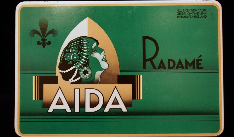
Why logo box design matters before the product is opened
Logo box design turns a plain package into a recognizable brand touchpoint while keeping the box focused on its core job: protecting and presenting the product. It is not just a matter of placing a mark on a panel. The design has to account for where the logo appears, how it reads at different sizes, how color behaves on the selected material, and how the artwork holds up through folding, shipping, stacking, photography, and retail display.
For most brands, the strongest result is simple, consistent, and production-aware. The logo should appear where buyers or recipients naturally look, sit within a clear visual hierarchy, and be adapted to the printing process instead of being forced onto the package after the structure is already fixed.
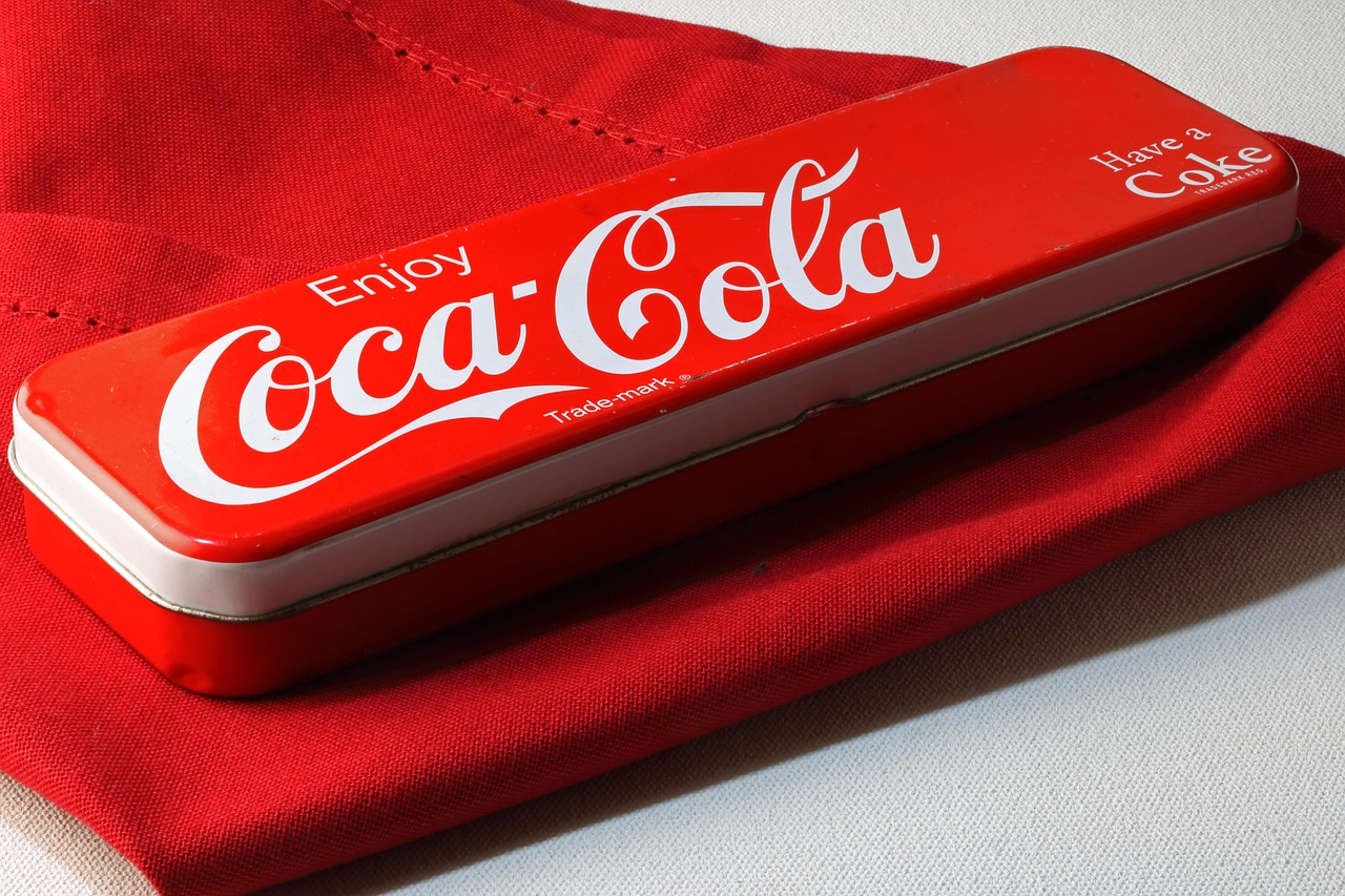
In packaging, the logo often has only a few seconds to work. It may be seen on a shelf, on a delivery box, in an unboxing video, or in a warehouse photo. That makes clarity more valuable than decoration. Good logo box design connects brand recognition with practical packaging decisions, including box style, material, print coverage, finish, cost, durability, and any applicable compliance needs.
This guide focuses on design choices that can be checked before production. For more packaging design topics, see the BOX DESIGN section.
Start with the box structure, not only the logo file
A logo that looks balanced on a flat screen can fail once it is placed on a real package. Box panels fold, overlap, curve, crease, and sometimes disappear under labels, tape, or shipping marks. Before deciding size and placement, review the design on the actual dieline or a measured mockup.
The first question is where the buyer or recipient will naturally see the package. On a retail carton, the front panel usually carries the main logo and product name. On an e-commerce mailer, the top lid or opening flap may create the strongest brand moment. On a rigid gift box, the lid may matter more than the side walls. On a shipping carton, readability from a distance and resistance to handling damage may be more important than luxury finishing.
Designers should also check whether the logo crosses folds, tucks, glue areas, or perforations. A logo placed too close to a crease can look distorted after assembly. A mark that runs from the lid to the base may look elegant in a 3D render, but it can misalign in production if tolerances are tight. For most commercial packaging, keeping the main logo on one clean panel is safer unless the structure is specifically designed for a wraparound effect.
Build a clear visual hierarchy around the logo
The logo should not compete with every other element on the box. A clear hierarchy decides what the viewer notices first, second, and third. For many branded boxes, the sequence is straightforward: brand mark, product or category name, essential details, and supporting design elements.
White space is one of the most reliable tools in logo box design. It gives the logo room to read and prevents the package from looking crowded. This does not mean every box must be minimalist. Colorful or illustrated packaging can still keep the hierarchy clear when contrast, scale, and spacing are controlled.
When a package carries multiple messages, the logo should be sized according to its role. A luxury candle box may use a small centered logo, with material and finishing doing much of the work. A snack carton may need a larger logo to compete on shelf. A subscription mailer may place the logo on the outer lid and repeat a smaller version inside to support the opening experience.
Common logo placement options
- Centered front panel: Simple, balanced, and suitable for premium or gift-oriented boxes.
- Top lid placement: Effective for rigid boxes, mailers, and packages photographed from above.
- Corner placement: Useful when product imagery or a large product name needs the central area.
- Side-panel repeat: Helpful for stacked boxes, warehouse handling, and retail displays where the front panel may not always face outward.
- Interior flap logo: Adds a brand moment during opening without crowding the outside design.
Choose colors that work on real packaging materials
Color is one of the most common failure points in logo box design. A brand color that looks precise on a screen may shift when printed on kraft paper, coated board, corrugated board, or textured specialty stock. The material underneath affects brightness, contrast, and perceived quality.
On white coated paperboard, colors usually appear cleaner and more saturated. On kraft board, colors become warmer and darker unless an opaque white ink or label layer is used. On black or dark stock, foil stamping, metallic ink, white ink, or screen printing may be needed for contrast. On corrugated board, the surface texture can reduce fine detail and make thin lines look uneven.
For consistent branding, designers should not rely only on digital mockups. A physical proof, drawdown, or printed sample is more useful when color accuracy matters. Review the proof under normal viewing conditions for the package’s real environment, such as store lighting, office lighting, or daylight near an unboxing setup.
Practical color checks before production
- Confirm whether the logo uses spot colors, process color, foil, embossing, debossing, or a combination.
- Check contrast between the logo and substrate, especially on kraft, dark, or textured stock.
- Avoid relying on very subtle tonal differences for small logos or shipping boxes.
- Ask whether white ink is needed under bright colors on non-white materials.
- Review how varnish, lamination, or coating may change the final appearance.
Match the logo style with the right print and finishing method
The printing method affects how detailed a logo can be and how much the final box may cost. A design that is easy to print in digital production may need adjustment for flexographic printing on corrugated board. A delicate line logo may work well with foil stamping on a rigid box but lose impact on a rough shipping carton.
Offset printing is often used for high-quality paperboard cartons where fine detail, photography, and strong color control are important. Flexographic printing is common for corrugated packaging and large production runs, but very small type and fine gradients need careful review. Digital printing is useful for shorter runs, versioned packaging, and fast sampling, although material and ink limits still apply. Foil stamping, embossing, debossing, spot UV, and soft-touch finishes can add tactile value, but they should support the logo rather than distract from it.
| Design choice | Potential benefit | Production caution |
|---|---|---|
| Large single-color logo | Strong recognition and simpler printing | Needs balanced spacing to avoid looking empty |
| Foil stamped logo | Premium look and high contrast | Fine details and small gaps may fill in |
| Embossed or debossed logo | Tactile brand experience | Requires suitable board thickness and tooling |
| Full-color logo | Useful for expressive brand systems | Color control depends on substrate and process |
| Repeated logo pattern | Creates texture and brand recall | Can become noisy if scale and spacing are not controlled |
Design for readability at real viewing distances
A logo box design should be tested at the distance where people will actually see it. A small logo that looks refined in a close-up render may disappear on a shelf. A complex emblem may become unclear when photographed as a thumbnail in an online store. A thin script logo may lose legibility on corrugated board or when printed in low contrast.
Readability depends on more than size. It also depends on shape, contrast, spacing, print quality, and surrounding graphics. If the logo includes small lettering, a simplified version may be needed for packaging. Many brand systems use a primary logo, a compact mark, a one-color version, and a reversed version. For box design, these variations are practical tools for adapting the same identity to different surfaces. See also: BUYING GUIDES.
Simple tests for logo readability
- Print the front panel at actual size and view it from normal buying distance.
- Take a phone photo and check whether the logo is still recognizable as a small image.
- Review the box design in grayscale to see whether contrast still works without color.
- Check the design on a flat dieline and as a folded physical mockup.
- Look at the logo beside required product copy to confirm it still has priority.
Balance branding with required information and packaging function
A logo is important, but it cannot override the functional and legal role of packaging. Depending on the product category and market, a box may need product identity, ingredients, warnings, barcodes, recycling marks, batch information, language requirements, or other mandatory content. These details should be planned early so they do not crowd the logo at the final approval stage.
For regulated products, design decisions should be checked against applicable rules before printing. This is especially relevant for food, cosmetics, medical-related products, children’s items, chemicals, supplements, and products sold across multiple jurisdictions. A visually strong design is not complete if it pushes required information into unreadable spaces.
Packaging also needs to function in transport and storage. Tape, labels, straps, pallet stacking, moisture, abrasion, and handling can all affect the visible logo. If the box is mainly used for shipping, the logo may need to avoid tape lines and high-wear corners. If the box is sold in retail, the front-facing panel, shelf height, and display orientation become more important. If the package is used for gifting, the opening sequence and tactile finish may carry more brand value than oversized graphics.
A practical workflow for better logo box design
A reliable workflow reduces costly revisions. The process should move from brand intent to structure, then to graphics, materials, proofing, and final production checks. When these steps happen in the wrong order, the logo often becomes a late-stage decoration instead of an integrated part of the package.
- Define the role of the box. Decide whether the package is for retail display, shipping, gifting, subscription delivery, storage, or a combination of uses.
- Confirm the structure and dieline. Review panel sizes, folds, glue areas, opening direction, and any areas hidden during assembly.
- Select the logo version. Choose primary, simplified, one-color, reversed, or symbol-only versions based on size and material.
- Set hierarchy and spacing. Give the logo enough clear space and decide how it relates to product copy, imagery, and required information.
- Match production method to design detail. Review whether the chosen printing and finishing methods can reproduce the logo cleanly.
- Create physical proofing. Check scale, color, contrast, folding, and opening experience before final production.
- Review handling conditions. Consider tape placement, shipping labels, abrasion, stacking, and photography needs.
This workflow also makes communication easier between brand teams, designers, packaging engineers, and printers. Instead of discussing the logo only as a visual asset, the team can evaluate it as part of a complete packaging system.
Common mistakes to avoid
Many logo box problems come from treating packaging like a flat advertisement. A box has edges, seams, material limits, and functional requirements. The following mistakes are common and preventable.
- Placing the logo too close to a fold. Even small folding variation can make the mark look off-center or distorted.
- Using too many finishes at once. Foil, embossing, spot UV, texture, and heavy graphics can compete instead of adding value.
- Ignoring substrate color. A logo approved on a white screen may not work on kraft, black, or textured material.
- Making the logo fight with product information. Required copy and barcodes need planned space, not leftover space.
- Approving only a digital render. Renders are useful for presentation, but physical samples reveal folding, scale, color, and texture issues.
- Forgetting secondary viewing angles. Side panels, top panels, and stacked displays may be more visible than the ideal front view.
Frequently asked questions
What makes a logo box design effective?
An effective logo box design makes the brand easy to recognize while respecting the package structure, material, printing method, and viewing context. It should be clear at real size, placed on a suitable panel, and supported by enough spacing and contrast.
Should the logo be large or small on a box?
The right size depends on the product, sales channel, and brand position. Retail packaging often needs stronger shelf visibility, while premium gift packaging may use a smaller logo with high-quality material and finishing. The best test is to review the design at actual size and normal viewing distance.
Can the same logo file be used for every box?
Not always. A brand may need different logo versions for different packaging surfaces, such as a full-color logo for coated cartons, a one-color logo for kraft boxes, and a simplified mark for small panels or textured materials.
How can a brand reduce printing problems with logo boxes?
Start with a correct dieline, choose a logo version that suits the material, avoid very fine detail when the print process cannot hold it, and review a physical proof before production. Early coordination with the printer or packaging supplier can prevent many issues.
Is a minimalist logo box always better?
No. Minimalist packaging can work well when it fits the brand and product, but clarity is more important than minimalism. A colorful or illustrated box can still be effective if the logo remains readable and the visual hierarchy is controlled.
Final thoughts on logo box design
Logo box design works best when branding and packaging decisions are made together. The logo should not be treated as a final sticker added to a completed structure. It should be planned with the box format, material, printing method, finish, viewing angle, and required information from the start. When these elements align, the package becomes easier to recognize, easier to produce, and more consistent in real-world use.
For packaging teams, the practical goal is not to make the loudest box. It is to create a box where the brand is clear, the product is understandable, and the finished package can be manufactured reliably. That balance is what turns a logo into a useful packaging asset.