Pizza box design that balances branding, delivery, and recycling
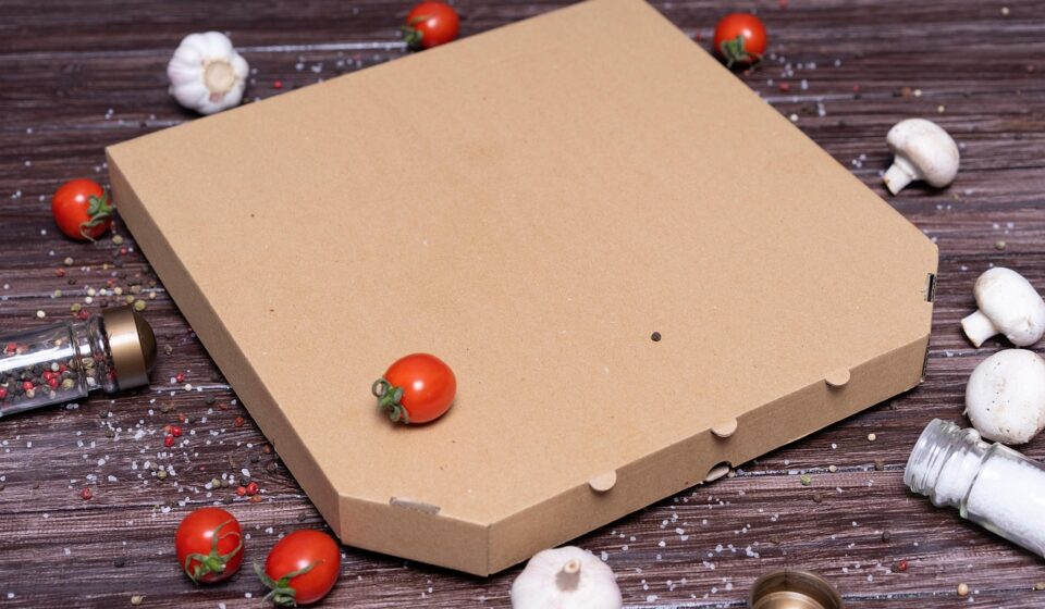
What a pizza box design needs to achieve
Effective pizza box design has to do more than carry artwork. It must keep the pizza presentable, help staff pack and move orders quickly, make the brand easy to recognize, and give customers practical disposal guidance after the meal. In use, the box is a food transport package, a stacking unit, a mobile brand surface, and often the final physical touchpoint before the customer eats. Those demands should shape the structure, food-contact expectations, print placement, and recycling language before the team spends time on colors, illustrations, or promotions.
For packaging teams, restaurant operators, and design studios, the goal is not to create the loudest box. The goal is to create a box that works during service, delivery, and disposal. This guide reviews the practical choices behind a commercially realistic pizza box, including delivery performance, branding, print areas, and environmental claims. More packaging layout ideas can be explored in the BOX DESIGN archive.
Start with the box structure before the graphics
The box structure determines how much freedom the graphic designer really has. A strong top-panel design will not compensate for a weak closure, poor stacking strength, or a layout that is slow to fold during a busy dinner shift. Before approving artwork, the team should confirm the box size, board grade, locking style, ventilation pattern, and usable print surfaces.
Size and fit
The box should match the pizza diameter closely enough to limit sliding, but not so tightly that the crust is crushed or cheese sticks to the lid. Standard sizes are often chosen for operational convenience because they fit existing shelves, delivery bags, and make lines. Specialty pizzas, square formats, stuffed crusts, or heavy toppings may require a deeper box or stronger board. A box that is too shallow can damage the product; a box that is too large wastes material and can make the pizza look smaller.
Stacking and delivery strength
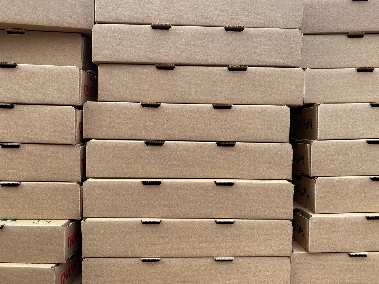
Pizza boxes are commonly stacked in shops, vehicles, and delivery bags. The lid and side walls must resist compression long enough for the food to arrive in good condition. Graphic elements should not obscure structural features such as fold lines, locking tabs, and ventilation cuts. If the design uses heavy ink coverage, the printer and converter should also confirm that the coverage will not interfere with creasing, folding, or glue performance.
Ventilation and moisture control
Hot pizza releases steam. If that moisture has nowhere to go, the crust can soften and the inside of the lid can become wet. Vent holes, board absorbency, lid clearance, and delivery time all affect the eating experience. More vents are not always better, because too much airflow can cool the pizza faster. The design task is to balance heat retention with moisture release, especially for brands that rely heavily on delivery.
Make branding visible without reducing usability
The pizza box is one of the most visible pieces of restaurant packaging. It may be seen by customers, delivery drivers, office groups, neighbors, and social media audiences. Even so, branding has to be planned around how the box is handled. The top panel is the main brand space, while side panels, inside flaps, and small instruction areas can carry supporting messages.
Use the top panel for fast recognition
The top panel should communicate the brand at a glance. A clear logo, distinctive color system, and simple graphic idea usually work better than crowded artwork. Because pizza boxes are often viewed from above or at an angle, the central area should remain readable even when boxes are stacked. If the design includes illustrations, patterns, or seasonal artwork, the logo area still needs enough contrast and clear space.
Treat side panels as delivery signage
Side panels are often visible when boxes are stacked on a counter or placed in a delivery bag. This space is useful for short brand messages, size labels, flavor checkboxes, reheating notes, or reorder prompts. For multi-location operators, side panels can also help staff identify sizes quickly. The copy should stay brief because side panels are narrow, folded, and sometimes partly hidden.
Keep digital prompts simple
QR codes, loyalty messages, review requests, and social media handles can work well on pizza boxes, but they should not compete with basic brand recognition. A QR code needs enough quiet space, strong contrast, and a clear reason to scan. “Order again,” “View menu,” or “Join rewards” is more useful than a code with no explanation. If the box may be exposed to grease or condensation, the code should be placed away from areas likely to stain.
Food contact and print choices shape the safe design area
Pizza boxes are food packaging, so the design process has to account for food contact requirements. In the United States, the FDA regulates food-contact materials and components under food-contact substance rules, including paper and paperboard components in relevant sections of the Code of Federal Regulations. For a practical design team, this means materials, coatings, adhesives, and inks should be specified for the intended use, not selected only for appearance.
Most pizza box graphics are printed on the outside surface, while the inside surface is expected to face hot, oily food. Designers should not assume that every ink, coating, or decorative finish is suitable near food. If printing is planned inside the lid or on interior flaps, the converter should verify whether that ink system is appropriate for the expected conditions. The same caution applies to grease-resistant treatments, liners, and special coatings.
Food safety also affects copywriting. A box can include reheating or storage reminders, but those messages should be accurate and should not overpromise. For example, a package can remind customers to remove food scraps before recycling, but it should not imply that every local program accepts every used pizza box. Clear, modest language is safer and more useful than broad claims.
Recycling and environmental claims need precise wording
Corrugated pizza boxes are at the center of a familiar recycling debate. Public guidance has shifted in many places because paper industry sources and recycling organizations have reported that typical grease and cheese residue does not automatically prevent pizza boxes from being recycled. The U.S. EPA also states in consumer recycling guidance that pizza boxes can be recycled when food scraps are removed and the box is flattened. Local recycling rules still vary, so packaging copy should not ignore program differences.
The American Forest & Paper Association says paper mills recycle pizza boxes and encourages local programs to update guidance where appropriate. A WestRock study on post-consumer pizza boxes found that typical grease levels observed in recycling streams were low and that cheese tends to be screened out during pulping. These findings support more confident recycling education, but they do not remove the need for careful wording. A box sold across many communities should avoid making a disposal instruction sound universal if access is inconsistent.
The FTC Green Guides are also important for environmental marketing language in the U.S. They advise marketers to qualify recyclable claims when recycling facilities are not available to a substantial majority of consumers or communities where the product is sold. The commonly referenced threshold is 60 percent. For pizza box design, phrases such as “recyclable where accepted” or “check local guidelines” may be more responsible than an unqualified claim, especially for regional or national distribution. See also: BUYING GUIDES.
Designers should also avoid vague statements such as “earth friendly,” “green,” or “zero waste” unless the brand can substantiate the claim. A better approach is to use specific, action-oriented copy: “Remove leftover food,” “Flatten before recycling,” or “Check local rules for greasy cardboard.” Specific instructions are more helpful to customers and less risky than broad environmental language.
A practical pizza box design checklist
A useful pizza box design brief should connect visual goals with production and disposal realities. The following checklist can help teams review a design before it moves into final artwork or print approval.
| Design area | What to check | Why it matters |
|---|---|---|
| Box size | Pizza diameter, crust height, topping load, and delivery bag fit | Prevents sliding, crushing, and material waste |
| Board strength | Stacking needs, delivery distance, and expected moisture exposure | Protects the product during transport |
| Ventilation | Vent number, position, and airflow path | Balances heat retention and crust texture |
| Top artwork | Logo visibility, contrast, and clear space | Improves recognition in stores, homes, and photos |
| Side panels | Size marks, ordering cues, or short brand copy | Helps staff and customers use the box quickly |
| Interior printing | Ink suitability and food-contact review | Reduces risk when graphics appear near food |
| Recycling copy | Local acceptance limits and claim wording | Avoids misleading environmental instructions |
This kind of review also helps prevent late-stage redesign. Many packaging problems appear only after the artwork is placed on a dieline: a logo crosses a fold, a QR code lands on a crease, a warning message is hidden under a flap, or heavy ink coverage makes small type hard to read. Checking the dieline early is one of the simplest ways to save time.
Common pizza box design mistakes and better alternatives
One common mistake is treating the pizza box as a poster. A box is folded, stacked, carried, opened, stained, and discarded. Artwork that looks impressive as a flat rectangle may fail after folding. The better alternative is to design on the dieline from the beginning and review a physical sample whenever possible.
Another mistake is using too many messages. A pizza box may be asked to carry a logo, menu items, social media links, coupons, sustainability claims, reheating instructions, allergen notes, and franchise information. When all of these compete for attention, none of them works well. The better approach is to set a hierarchy: brand first, operational information second, promotional content third.
A third mistake is placing important information too close to folds, vents, or locking tabs. Small type can disappear when the board creases, and graphics can look misaligned when panels overlap. Designers should keep key text inside safe zones and use larger type for any instruction that must be read quickly.
A fourth mistake is overstating sustainability. Many customers appreciate recyclable packaging, but claims must be specific and supportable. A pizza box can encourage recycling without promising that every box will be recycled in every community. Clear disposal instructions are more credible than broad environmental slogans.
Frequently asked questions
What makes a pizza box design effective?
An effective pizza box design protects the pizza, supports fast packing, presents the brand clearly, and gives customers useful instructions. The best results come from designing the structure, artwork, and copy together rather than treating graphics as the final step.
Should a pizza box have ventilation holes?
Ventilation can help release steam and reduce sogginess, but the number and position of vents should match the pizza style, delivery time, and board structure. Too little ventilation can trap moisture, while too much can release heat too quickly.
Can greasy pizza boxes be recycled?
Many recycling and paper industry sources now say pizza boxes can often be recycled if leftover food is removed and the box is flattened. However, local recycling programs may set different rules, so packaging instructions should encourage customers to check local guidance.
Is it safe to print on the inside of a pizza box?
Interior printing should be reviewed carefully because it may be closer to hot food, grease, and steam. Designers should confirm with the packaging converter that inks, coatings, and materials are suitable for the intended food-contact conditions.
How much branding should appear on a pizza box?
The box should carry enough branding to be recognizable without becoming cluttered. A clear logo, strong color system, simple top-panel artwork, and concise side-panel information usually perform better than dense copy or overly detailed graphics.