Gift box design for retail-ready packaging and memorable unboxing
What effective gift box design needs to achieve
Gift box design sits at the point where structure, branding, production and customer experience meet. A well-designed box protects the item, feels appropriate for the price point, photographs well, opens smoothly and communicates the brand without relying on unsupported claims. In retail, it also has to work on shelf and carry the required product information. In ecommerce, it must survive handling and still feel giftable when it reaches the recipient.
The best projects usually begin with a practical question: what does the box need to do before it can look beautiful? Once product weight, fragility, sales channel, display needs and fulfillment method are clear, the visual system is easier to control. The result is not just a decorative container, but packaging that supports buying confidence and repeat recognition.

For more packaging structure and branding articles, browse the BOX DESIGN section.
Start with the product, channel and handling journey
Gift boxes often run into problems when surface graphics are designed before the handling journey is understood. A box for a perfume set, a watch, a chocolate collection and a ceramic mug may all be described as gift packaging, but their structural and handling requirements are not the same.
Before choosing a format, define four basics:
- Product risk: Is the item fragile, heavy, sharp-edged, temperature-sensitive or prone to scuffing?
- Sales channel: Will the box be displayed in store, shipped directly, placed inside a mailer or used for corporate gifting?
- Opening behavior: Should the customer see the product immediately, discover it in stages or reuse the box for storage?
- Information load: Does the packaging need barcodes, ingredient lists, safety marks, recycling guidance or multilingual copy?
These answers affect structure more than style. A rigid drawer box can create a premium reveal, but it may not be the right choice when fulfillment speed, cube efficiency or shipping weight is the priority. A folding carton can be cost-efficient and retail-ready, but it may need an insert or sleeve to create the experience expected from a gift product. A magnetic rigid box can feel substantial, but magnets, laminated surfaces and mixed materials may complicate recycling claims in some markets.
Choose a structure that supports the brand promise
Structure is one of the strongest brand signals in gift packaging. Customers often judge quality before reading the copy, based on weight, fit, opening resistance, edge finish and how securely the product sits inside the box.
Rigid boxes for premium presentation
Rigid boxes are common for luxury, beauty, electronics, jewelry and high-value gift sets because they hold their shape well and create a strong tactile impression. They can support lift-off lids, shoulder neck boxes, book-style boxes, drawer formats and hinged magnetic closures. Their main advantage is presentation; their usual limitations are material use, storage volume and unit cost.
Folding cartons for flexibility and efficiency
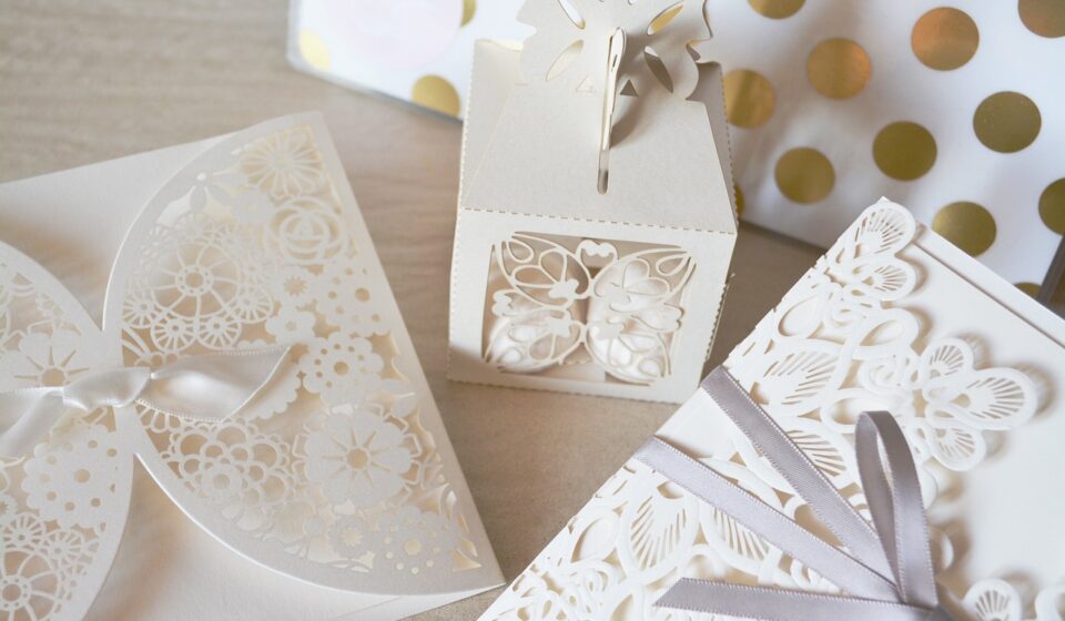
Folding cartons are useful when a design needs strong graphics, efficient transport and easier scaling. They can be die-cut, windowed, embossed or combined with paperboard inserts. For many mid-market gift products, a well-engineered folding carton with thoughtful finishing can outperform an overbuilt rigid box because it balances appearance, cost and logistics.
Sleeves, wraps and inserts for modular gifting
Sleeves and inserts allow one core box to support multiple seasonal or promotional versions. A brand can change the outer artwork for a holiday launch while keeping the inner structure consistent. Inserts also prevent product movement, create compartments and control the reveal. The key is to avoid adding layers that do not improve protection, communication or experience.
Build the visual system around clarity, not decoration
A gift box needs to attract attention, but too many decorative elements can reduce perceived value. Strong visual design usually depends on hierarchy: one primary brand cue, one product cue and one emotional cue. If every panel tries to carry a message, the design becomes noisy.
Useful visual decisions include:
- Color palette: Limit the palette so the box remains recognizable in small photos and on crowded shelves.
- Typography: Use type sizes that remain readable after printing, especially on textured or dark stocks.
- Logo placement: Treat the logo as part of the composition, not as an oversized badge on every panel.
- Finishing: Use foil, embossing, debossing, spot UV or soft-touch effects only where they strengthen the concept.
- Photography: If product images are used, make sure they closely match the actual item, scale and color.
Minimal design can work well for premium gifts, but minimal does not mean empty. It depends on proportion, spacing, material choice and print quality. Expressive illustration or pattern can also work for seasonal gifts, confectionery, children’s products and cultural gifting, provided the artwork does not hide practical information.
Design the unboxing sequence as part of the product experience
Unboxing is not only a social media moment. It is also the first physical confirmation that the buyer made a good choice. With gift packaging, the recipient may not have selected the product, so the box needs to create trust and anticipation quickly.
A clear unboxing sequence can include:
- Recognition: The outside confirms the brand, occasion or product category.
- Opening cue: The lid, pull tab, ribbon or tear strip makes the opening method obvious.
- Reveal: The product is framed neatly instead of appearing loose or buried.
- Support information: A card, inner print or small insert explains use, care, ingredients or authenticity.
- After-use value: The box can be reused, flattened, recycled or stored without confusion.
The sequence should feel intentional, not wasteful. Tissue, ribbons, cards and internal wraps should each have a role. If an element only adds clutter, it may weaken both the sustainability story and the user experience. For ecommerce gift boxes, the sequence also needs to account for the outer shipping pack. A beautiful inner box loses impact if it arrives crushed or covered with fulfillment labels.
Make sustainability claims specific and verifiable
Sustainability is now part of many packaging briefs, but it is also an area where vague wording can create risk. Terms such as eco-friendly, green, recyclable, compostable and plastic-free should not be used casually. In the United States, the Federal Trade Commission’s Green Guides explain that environmental marketing claims should be supported by competent and reliable evidence. Recyclable claims may need qualification when recycling facilities are not available to a substantial majority of consumers or communities where the product is sold.
For paper-based gift boxes, certification marks and recycled-content claims also need control. Forest Stewardship Council labeling, for example, generally requires an appropriate certified supply chain and approval for label use. If a brand wants to show a certification mark on the box, that requirement should be discussed early with the printer or packaging supplier rather than added at the final artwork stage.
In the European Union, Regulation (EU) 2025/40 on packaging and packaging waste strengthens attention on packaging minimization, recyclability and empty-space reduction. For brands selling into the EU, gift box design should therefore be reviewed not only for appearance, but also for material efficiency and compliance with the relevant timeline and obligations. See also: BUYING GUIDES.
Practical design choices can reduce problems:
- Use mono-material structures where possible.
- Avoid unnecessary laminates when an uncoated or aqueous-coated finish can meet the brief.
- Separate decorative sleeves from the main box if it improves sorting or reuse.
- Use removable inserts when the box and insert are made from different materials.
- Keep environmental claims narrow, factual and supported by supplier documentation.
Plan for barcodes, labels and future information needs
Gift boxes often leave barcode and label placement until late in the artwork process. That can lead to crowded back panels, awkward stickers or design compromises close to production. A better approach is to map mandatory and operational information at the dieline stage.
Retail packaging may need a linear barcode, batch code, product name, quantity statement, country of origin, warnings, recycling instructions or importer details. Some categories require more formal labeling than others. If the product is food, cosmetics, toys, electronics or supplements, the gift box may need regulatory review before artwork approval.
Packaging teams should also watch the transition toward 2D barcodes in retail. GS1’s Sunrise 2027 initiative is intended to support retail point-of-sale systems that can read 2D barcodes in addition to traditional linear barcodes by the end of 2027. For gift box designers, the practical point is not to use a QR code as decoration, but to reserve space for scannable codes, quiet zones and data-linked consumer information where appropriate.
Check production details before final approval
A gift box can look excellent on screen and still fail in production. Print, finishing and assembly should be considered before artwork is locked, especially when the design uses dark colors, metallic foils, fine lines, small type or full-coverage ink on textured board.
A prepress checklist should include:
- Dieline accuracy: Confirm cut, crease, glue and bleed areas are correctly marked.
- Panel orientation: Check that artwork direction matches the folding and opening sequence.
- Color control: Use realistic expectations for paper tone, coating and print method.
- Finishing tolerance: Leave enough space around foil, embossing and spot coatings.
- Insert fit: Test whether the product can be packed and removed without damage.
- Shipping test: Review whether the gift box needs a protective shipper or corner support.
- Claim review: Confirm all sustainability, certification and disposal statements are documented.
Physical sampling is worth the time. A prototype shows hand feel, opening force, product movement and edge quality more clearly than a rendering. It can also reveal whether the unboxing sequence is intuitive. If users hesitate, tear the wrong panel or cannot replace the product neatly, the design needs refinement.
Common gift box design mistakes to avoid
Many packaging problems are not caused by poor taste. They come from decisions made in the wrong order: choosing a box style before defining the channel, adding premium finishes without considering recyclability, writing vague environmental claims, using inserts that are difficult to pack, or treating the back panel as leftover space.
Another common issue is overpackaging. Gift packaging should feel generous, but excessive void space can frustrate customers and increase material use. A more useful design goal is controlled abundance: the product should feel well presented and protected, while the structure remains proportionate to the item inside.
Brands should also avoid copying luxury cues without understanding why they work. Heavy board, black paper, gold foil and magnetic closures do not automatically create a premium experience. They only work when the product, price, audience and sustainability expectations support them.
Frequently asked questions
What makes a gift box design look premium?
Premium design usually comes from proportion, material choice, fit, restraint and finishing quality. A simple rigid box with clean edges and a controlled reveal can feel more premium than a busy design with too many decorative effects.
Is a rigid box always better than a folding carton for gifts?
No. Rigid boxes are strong for presentation, but folding cartons can be more efficient, lighter and easier to scale. The better choice depends on product value, shipping method, display needs, budget and sustainability goals.
How should sustainability be handled on gift packaging?
Use specific, documented claims instead of broad language. If the box uses recycled content, certified paper or recyclable components, the claim should match the actual materials and the markets where the package is sold.
Should a gift box include a QR code?
A QR code can be useful when it leads to care instructions, authentication, product origin, gift messages or recycling guidance. It should be placed with enough space to scan reliably and should not replace legally required on-pack information unless local rules allow it.
What should be checked before printing a gift box?
Check the dieline, bleed, panel orientation, barcode space, finishing layers, color expectations, insert fit and packaging claims. A physical sample is strongly recommended before full production.